Friday, June 21, 2013

Elephant in the Room


A good drawing doesn't necessarily translate to a good painting.
I sometimes marvel at how my final painting looks so much like my initial sketch.  Or in this case, I marvel at how much the the final painting doesn't look at all like the initial sketch.  I marvel at the loss in translation.  Admittedly, I prefer the first quick drawing that I did in pen and ink.  The more I studied the thing before me, the more I understood the physical.  The more I rendered it, the further away I went from the emotional, or my first initial response.

Oil paint isn't always the best medium to use in order to render that thing or idea you want to describe.  Think about what it is you want to describe and how you want to describe it--your motive.  Then choose the appropriate medium that will help best communicate that emotion/idea.  Another example is how a good photograph doesn't necessarily translate to a good painting.  I prefer to work from life as much as possible.

Monday, June 3, 2013

Spirit of Myself

Here lies an exercise.  Simply, a painting of an object (a toy elephant) placed on a cardboard box.  And yet, a most difficult one if the artist does not paint for oneself.

Technically:
I painted most of my groundwork with Alizarin Crimson (I don't know why... I just did... I suppose I wanted to brake from my usual approach.).  Over it, I painted thicker more accurate color.  The objective was to be imaginative, to be expressive and to have a clear motive.  I also wanted to use color in a way so that I would "feel" what color I wanted to use.  Since I instinctively chose to do most of the under-painting with Alizarin Crimson, a simple color theory of red vs. green naturally revealed itself.  Even the gray color of the elephant was mixed largely using the Alizarin Crimson red and the green from the background.

I rendered more finely only those details that helped express my overall idea and let the other less important details go.

Creatively (and more important):
My imagination and the psychology behind my vision is what drives the technical aspects of my painting.  My idea will dictate the means needed, the tools necessary and the appropriate medium required to carryout that idea--not the other way around.  So for this painting, I was searching for the characteristics that I liked and attracted me to want to paint this thing.  I wanted to express myself, create a mood and learn what things I liked from my experience with it, in this particular time and place.  Just imagine all the happenstances and past experiences that may be triggered and brought to the surface of one's consciousness just by looking at the object.  I wanted this painting to be more about myself rather than the elephant.

I did this, in part, by allowing myself to respond to color instinctively and not paint so... well, literally.  By "letting go" just a bit and loosening the noose on reality, my imagination was triggered to See other realizations.  Details which come to life and are relevant in my world.  In a way, I choose to see what I want to see--not allowing what I see to overtake how I want to present it.  A story begins to form and the painting comes alive.

Really, I look for what I like... and, to figure-out what one may like and why one may like something, may be the truest exercise to be had. 

Friday, November 16, 2012

Warms, Cools and Neutrals

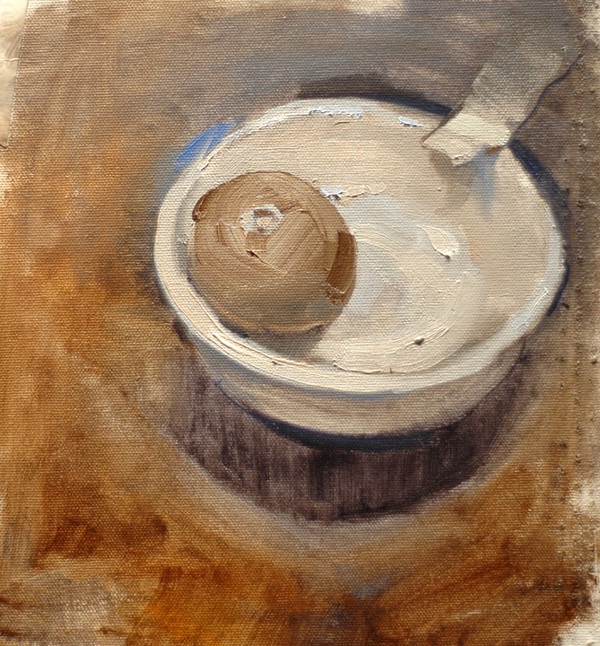
Here's a quick exercise of a bowl and orange.  I used a limited palette of just Ultramarine Blue, Burnt Umber and Titanium White.  I mixed my own black by using Ultramarine Blue and Burnt Umber.  So, in-effect, I can say this is painted with just black and white.  By using a two-part black I can choose to mix a warmer black or a cooler black, or a neutral black.  I can make the shadows appear warmer by using more Burnt Umber, or cooler by using more Ultramarine Blue.  You'll do the same with the lights.  You'll learn to mix shadows cool and your lights warm.  Or, vice-versa: lights cool and shadows warm. 
Also note how the upper right corner is a neutral gray.  Don't forget that neutrals can be an integral part of the overall design (neutral: meaning, lacking color or an assigned temperature).  By having neutral shapes, you are taking the viewer's eye away from the neutrals and leading the viewer's eye toward the more predominant color shapes.   Learn to design your neutral shapes along with your warm and cool shapes.

Another useful exercise is to paint a still life made up of all white objects.  For example, a white mug, with a white napkin, on a white tablecloth, on a white table, with a white background... and so-on. This will push you to see the subtlety of hues within whites.  Yes, everything is apparently white... but what color white is it?  It will be some varying degree of temperature (cool-neutral-warm). 

This is a great way to develop your eye to see warm vs. cool, the extremes of their relationship and the use of neutrals. 

Monday, November 5, 2012

Class Demo--Painting Without Color


Color Can Sometimes Be Overwhelming

Alright, so color is not working out. It seems the more you mix color, the more you continue to further aggravate yourself with every muddy decision. What's the solution? Don't use color... for now.

Students commonly make the mistake of attempting to tackle all of their painting issues at the same time. This is a sure way to quickly become overwhelmed. Instead, I recommend identifying each issue one at a time. Solve it, then move on to the next. Be honest about identifying your issues and create new tactics to solve them. Change the way you are looking at things, i.e., if being trapped inside your box is giving you nothing but grief... step outside of it.  

Try painting with just black and white. This frees you up so that now you may afford the luxury of focusing on other issues, such as: value, edge intensity and paint thickness.  You'll become more sensitive to color after having denied yourself of it.  When you begin to slowly introduce color again, you'll begin do so with a greater appreciation and sensitivity for cools and warms, value and intensity, and how little color is needed for something to be perceived as colorful. A whole new world begins to open up and you soon forget your previous frustrations.

The moral of the story... simplify.  I really can't say it enough.  Painting is about simplifying. Simplify your approach, your actions, your thoughts, your problems, your way of seeing... simplify everything, K.I.S.S (Keep It Simple Stupid).

"Never increase beyond what is necessary, the number of entities required to explain anything."
                                                                     -William of Ockman (1285-1349)

Thursday, May 3, 2012

Class Demo • Oil Portrait

Recollections from our classroom demonstration:

• Start off the painting by holding back from going too dark at the beginning.  You can always go darker or lighter later on, but for now, practice restraint.  I like to start off a value or two lighter than my darkest dark.  Treat the lights in the same manner, painting them a value or two darker than the final value you plan to end up with.  I'll lighten things as I go, saving the darkest darks and the lightest lights for the very end.  Remember to simplify you values.  I like to brake things down into 3 elements. You only need to be concerned with darks, mid-tones and lights.

•  Get a feel for transparent paint and opaque paint.  At the beginning of a painting, I like to start off with washy/transparent paint, using turpentine and/or linseed oil--or just Liquin.  As I develop the painting, I progressively use less medium and get more and more thick with my paint strokes (using little to no medium toward the end when I'm gobbing on my highlights).  I'll try my best to preserve my darks.  However, if I do go back into them, I do so with transparent paint.  Thick paint for the lights and transparent paint for the darks.  This way, when the painting is completed, the dark brushstrokes won't catch the light that is shining on the painting and the light brushstrokes will.

•  Tip for how to paint glasses: I like to paint them in toward the middle/end of the painting after I have my basic features of the face blocked-in.  Reason being, I can paint the skull structure and flesh in first without having to worry about the glasses getting in the way. And after putting the glasses in toward the end, I can then afford to paint around the outside of the glasses, if needed.  This allows me to redefine varying edge intensities around the rim of the glasses and more accurately render the thickness of the frame, if needed.  As a final touch, I may add the shiny highlights of the glasses at the very end (if they're not too distracting and don't take away from my overall intent of the painting).