Monday, May 26, 2014

Painting from sketches...

Painting done in studio from sketchbook drawing
Value study done on computer
Original drawing done on location

The Pool House, aprox. 7x10 inches. This is a painting done directly from a drawing done in my sketchbook. I completed the drawing on-site then did the painting in the studio using the drawing as my only reference. Painting from sketches is a great way to push the imagination, improve memory and improve drawing practices. It will push you to recollect basic information. You will find that your drawings will now have a driving force, a purpose and an ability to record only the information needed to complete a finished painting. The rest will be left to the imagination. Trust in yourself and your brain muscles. You will learn to simplify and you will achieve much more interesting results in the process.

Wednesday, May 14, 2014

Yurmby Color Wheel

Here's the Yurmby color wheel, approximately 12 x 12 inches in diameter. A valuable exercise in toning the colors on your palette. I used the primary colors on my existing palette including magenta and cyan. All you need to do is progressively add more gray to each color step as it approaches the center of the wheel. The middle value gray dot used in the center of the wheel is the same value gray I used to tone all the colors. Colors I used: Y=cadmium yellow pale, R=cadmium red, M=Permanent Magenta, B=French Ultramarine, C=cyan (manganese blue phthalo), and G=cyan+cad yellow pale. You will find that mixing your batches of paint with a palette knife is critical, you will build a sensitivity to how value alone affects color and you will also learn to be more organized when mixing batches of paint on your palette.

Here's a great website created by Richard Robinson and offers an interactive color wheel where you can create your own gamut masks in virtual reality!

http://www.livepaintinglessons.com/gamutmask.php

Friday, April 18, 2014

Collecting Your Own Reference

Collecting your own reference opposed to using someone else's is a sacred part of an artist's process. Without it, you are missing-out on a multitude of factors including emotional content. If you want to go beyond your reference you must experience the thing first-hand. For example, by taking this photo myself I had the opportunity to experience the moment and all its immeasurable details. I became intoxicated by the event, smelt the horses, felt the thumping of their hooves, heard the sounds of the crowd, befriended the culture, placed my bets on the horses and so-on and so-forth. Not to mention the experience as a whole gave me an invaluable sense of time and place. A true human experience. An experience that created a story which sounds more like a bundle of emotions than just an account of events. Life is art and art is life. And so, your life and your life's experiences collectively make-up your art. This emotional content gathered from the experience of living is what makes art so powerful and is very much irreplaceable. If you want to make good art, profound art, then I suggest taking-in and experiencing as much of life has to offer... then make it.

Class demos

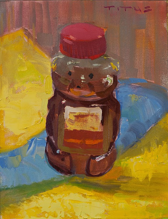
Honey Bear, 10x8 inches
These exercises are a lot of fun. They're not large or complicated so I feel like I can just paint. I can paint like a child and not worry about creating my next great contribution that will shake the core of the Art World. I paint like a child and without my critic. I completely let go and use what I have learned about painting only if it occurs to me.

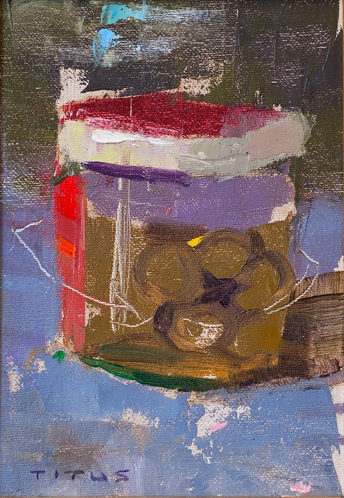
Jar of Olives, 7x5 inches
I may now concentrate on one fundamental of painting at a time and not get overwhelmed. Perhaps in this exercise my focus was about brush stroke and becoming intimate with all the different ways of applying the paint. Do I use a brush, a palette knife, the handle of a brush, a shoe or do I scrape into the canvas with a palette knife? I want to become intimate with and feel each stroke as if time has slowed down. I feel and become more sensitive to the amount of pressure applied to each stroke as well as how much paint is being loaded into the bristles.
 
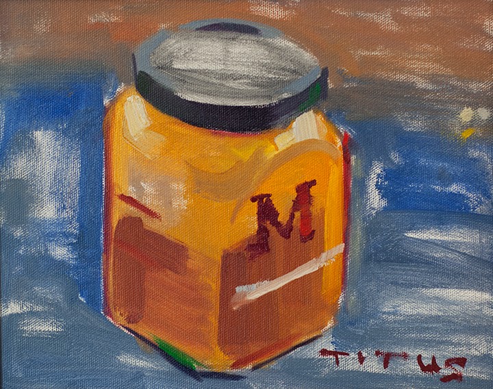
Marmalade, 8x10 inches
In this exercise my focus was on using brown and black to tint my colors. I found that if I used black (or varying shades of it) to tint orange, the oranges turned more of a green. If I used brown (or varying shades of it) to tint orange, the oranges stayed warmer. And, if I used brown and black together the orange would become darker or lighter without leaning toward green or brown. The same was applied to all the other colors. Because of this, I used more gray in the light side and more browns in the shade side to imply the warm and cool of the natural light conditions (warmer shadows and cooler lights).


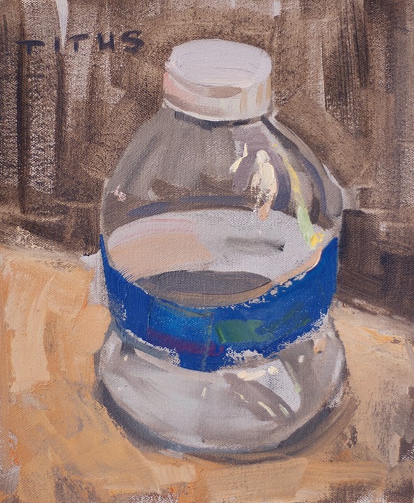
Water Bottle, 10x8 inches
This exercise I used just black and it's varying shades of grays to tint my colors. Super simple. Super easy. Even a kid can do it.

Wednesday, March 5, 2014

Friday, January 17, 2014

Techniques for getting yourself painting again.


You're in that rut? That's not good. 

Well, there's quite a lot you can do to get out of the rut if you put your mind to it. When I get like that I like to think about painting as something that is done for fun, for your enjoyment only and for pure leisure and escapism. Certainly don't make a big deal about the whole act and don't worry about rules or approaches that must be done. Your critic must be dissolved. Paint as if no one will ever see the painting. Anything you do will be received with great celebration by yourself. Paint using your child instincts and purely for the enjoyment of the act itself. Every stroke is a very fulfilling exploration of yourself and the thing your painting. If you paint trusting your child-self, where you are the only one with all the answers you'll ever need, then your artist voice will start to take over. 

I also try to relax, experience life and think about things that inspire me to want to paint. They may be philosophies, inventions, people, places or things from my imagination. I draw a lot and develop this conversation in my sketchbooks. Paint or draw simple things or take complicated things (compositions) and make them simple. 

I like to think of the things that I like and why I like them. Thinking about why you like something leads to greater awareness and deeper investigation. 

Try writing. Write in your sketchbook or journal. Creating a blog for your artwork is a great place to focus on writing about your art in-depth. Writing helps me keep a dialog going about where I'm at with my art, the way I see the world and understanding my journey.

Try teaching. Show someone else whether a child or a classroom full of adults what you know about drawing, painting, sculpture or art in general. Verbalizing out loud what you know in front of an audience helps you make clear to yourself and others your approach and ideas about painting. You will also find that you will not have time for negativity and your critic will begin to dissipate. 

Record your dreams immediately upon waking. Write down in detail in your journal or do a quick sketch in your sketchbook. You will surprise yourself. Your dream-inspired sketches are a more honest interpretation of your unsolicited inner voice. 

Listen to music. Listening to music while you create or while you're not creating is a great engine. This usually gives way to me reasearching new and existing bands. 

And, when I'm really at a road block in life, I like to listen to Gene Wilder's song, "Pure imagination":

Or, I'll try having a drink of beer or three. I'll listen to music and find new musicians that inspire a different state of mind or emotion. I also like spoken books or recordings of rants by artists, writers and poets. 

I'll hang out with other artists and talk about art or things that inspire them. I like to hear their perspective and how they see things. I find their points of view are usually more optimistic than my own, and optimism, usually leads to greater in-depth thinking and discovery. 

I'll work out at the gym or at home (but usually not while drinking). Practicing Yoga or just plain stretching can be a great way to awaken the muscles and refresh your physical body.  And, having a moment or two through out each day to meditate--or really, just call it whatever you want. I like to call it listening and feeling the sun on my skin.

Read a book. I like to read many books on artists that talk about their life and art. I like to read whatever... Hemingway, F. Scott Fitzgerald, Kurt Vonnegut, or even a self help book about greater consciousness and awareness. The book I'm reading now is a book by Jon Kabat-Zinn, Wherever You Go There You Are. It talks about non-doing.

When I'm not quite in the mood to actually make art, I'll do things that are related to enabling the act. I'll build stretcher bars, stretch canvas, build frames, clean glass on existing pieces, take pictures of them or scan them, cut mat board, clean and organize my studio, or even shop for supplies online or in stores. 

Collect reference. I bum around and take pictures with my camera of things that I like (buildings, people, whatever). I may even do a quick sketch of it as a way of documenting it as well. 

Go for a hike and sketch along the way. Sketching isn't always necessary, sometimes just "taking-in" is all that is needed.

I also like to do non-art related activities, such as: fixing my car or house, cleaning my car and truck, studio or house, or doing something nice for someone else.  

Go to museums or galleries where you can see the original works of art. I like to feel the energy the originals have, especially Rembrandt's. I also go to local art shows and gallery openings to support other artists. 

I find that planning out my projects that I am going to work on sometimes helps. Having a clear picture of what you plan on setting out to do such as a series can help motivate you and steer you in a direction. 

Go on Youtube and watch artists paint their pictures. 

I'm usually always researching obscure artists so that I may find a language that resonates with my own. I recently found an artist that I really like, Arthur Clifton Goodwin. In these, I look for new inspiring approaches that lead me to the sheer joy of painting.   
Try looking at this great blog that I recently found. There are many great artists I've never even heard of and I'm sure they all went through the same tribulations. 
http://bjws.blogspot.com

Also, don't forget to get proper amounts of sleep and nutrition. Sleep greatly affects creativity. It's one of the first things I check when I'm in a rut or depressed for that matter. I ask myself, Have I had something to eat? Have I been drinking water? Have I gotten my eight hours of sleep?

Tuesday, October 1, 2013

Investigating Light–As An Oil Painter Sees It

As an oil painter, understanding the basics behind the subject of light will help shed awareness on color mixing. This section is about identifying the temperature of light and how it impacts the use of white in your mixes. 

When evaluating which colors to mix in response to a light source, it helps to first identify the source as being natural or artificial. This is because the two emanate distinctively different temperatures. As a general way of looking at it and for simplicity's sake, we can say that natural light is cool and artificial light is warm. Natural light (light coming from the sun) is generally whiter (cooler), or known as balanced light. Artificial light (man-made light or light bulbs) is generally warmer. Let's investigate both these scenarios. 

How an artist sees light
Let's begin with natural light and how it impacts our color mixing.
Natural Light (light coming from the sun) is cool. This doesn't mean you're not going to use warm colors in your lights such as yellows, reds, oranges and warm browns. Yes, you will use these warm colors. However, you will use them with some amount of white added into the mix. This is called a tint or tinting a color. A tint is the mixture of a color with white. It is critical that a painter is aware of when white is added to a color you are automatically cooling-off and making less intense that color, it becomes a tint of that color. The color is in a way deadened or neutralized by adding white to it. It helps to think of white and black having the same neutralizing affect on color, they subdue color.

Artists refer to the temperature of natural light as being cool (this is, of course, an exception to sunrise and sunset). The brighter the sunlight, maybe too, the more white added and washed-out the color becomes. For instance, red is intrinsically warm. However, once white is added to it it then becomes a lighter tint of red and, as a consequence, it becomes cooler. Pink is just another name for a cool red. Instead of calling it "pink" an artist more accurately identifies it as being red with however much white added to it. The word "pink" is less descriptive and is really not as much use a term for an artist's vocabulary.

What is important is that the red's intensity has been lessened by the white. An artist now begins to more accurately make a distinction between the amount of red vs. the amount of white in the mix. This is valuable to a painter because a painter needs to be able to gauge the intensity of a color and how much white may be in it, its tint.

The science of light
Forget you are an artist painter for a moment. From a scientific perspective, natural light is generally refereed to as cool because the sun burns both extremely bright and hot, commonly known to artists as white light or perfectly balanced light (not too warm and not too cool).

Earth's atmosphere is why natural light is sometimes seen as a cool blue. Our dense atmosphere is made up of water particles that absorb most all the color bands of light, letting go of blue. This refracting and reflecting light is also what makes the ocean look blue. A brief exception occurs during sunrise and sunset. While the amount of light (Lumen) is slowly diminished during sunset, so too does the bright white light and it begins to warm to that of a candle before it's extinguished. The light that does remain has to pass through our dense atmosphere at a more extreme angle to the horizon—where the pollution also cares to dwell. Light passes through pollution particles and further contributes to a warm light cast. The opposite scenario is true... the hotter and brighter a light source gets the cooler the light is perceived.

Artificial light
Artificial light (light emitted by manmade light bulbs) is probably the most complicated of all the light sources because of the many different types of bulbs on the market. Although in the past artificial light was known as being warm. However, these days, the many different types of bulbs offered can be warm or cool or even in some cases, perfectly balanced. An artist must have an understanding of the different types of bulbs available and which ones are of use. Most bulbs lean on the side of warm or cool and usually not well balanced.

Bulbs
When shopping for light bulbs it is common to find the Kelvin listed but not the Lumen. Why? Lumen is a measurement gathered based on how for you are from the source. They couldn't possibly tell you the Lumen unless they knew how far away you were standing from the source, or how large the room is, or how much reflected light or other factors. Instead, manufacturers list the wattage of the bulb, i.e., the output based on how much energy the bulb uses. The more energy it consumes the brighter the bulb. They will also list the temperature output of the bulb in Kelvin. Artists generally look for bulbs that are 4,500-5,500 Kelvin. This number range is what represents an emulation of natural light. Any higher a value and the light becomes too cool. Any lower a value and the light becomes too warm.

An artist must be aware of the many types of light bulbs and their varying degrees of cool and warm. Energy saving bulbs give-off a violet cast, some a greenish cast and so-on. There is perfectly balanced lighting available however, none of it can be found at Home Depot or your local hardware store. Please see my blog post which talks about what types and brands are available.

Light measurements
Two units used for measuring light output are the amount of light being emitted (Lumen) and its temperature (Kelvin).

Lumen is the measurement used to describe the total amount of light emitted by a source based on the distance you are from the source, i.e, how bright something is based on how far away you are from it.

Kelvin is used for measuring temperature (how hot the output source). White light exists (as manufactured bulbs describe) around 5,500 Kelvin.

Another consideration to artists regarding bulb technology is the color rendering index (CRI) which is important information when purchasing higher-end bulbs, balanced bulbs. CRI has a percentage measurement from 1 to 100. 100 is the value closest to white light, otherwise known as natural light or perfectly balanced light, which is not too warm and not too cool. When looking to purchase studio lighting that emulates this natural white light, it is not hard to find inexpensive fluorescent T8 tube type bulbs having a CRI of 98%. Please refer to my light your studio section for more information.

CRI is a scale of measurement used to describe a light source's ability to reproduce the colors of various objects faithfully in comparison with an ideal or natural light source.

Lumen and Kelvin influence each other and contribute to the overall perceived value of a source's temperature and total light output. Too little Lumen and the light will become dimmer and warmer, like a candle. And, the more the Kelvin the more the light will be perceived as being brighter and cooler. The Sun is very hot and very bright. It has major amounts of both Lumen and Kelvin—so the light is very bright and white. Compare this to a candle which is very dim and very warm. In other words, very low in Lumen and Kelvin.

As incandescent bulbs are being phased-out they are being replaced by energy efficient Compact Fluorescent Light (CFL) bulbs. Artists are discovering that CFL's have some use in their studios because of their availability, low price and the cooler light output compared to that of an incandescent. Yes, these bulbs are cooler than incandescent but they do still emanate a sometimes blue, violet, orange or greenish tinge. However, this bulb technology is quickly improving and won't be long before it can produce a more useful balanced (white) light.

Until CFL's are improved, artists are finding that the most balanced light comes from designer fluorescent tubes (T8 tubes, 32 watt, 98% CRI).  They cost about $10 each and they provide a balanced white light and are also known to help alleviate symptoms created by Seasonal Affective Disorder (SAD). The T8 tube is the bulb I would choose if I had only one choice. They do a great job with brightening the entire studio without having to deal with direct lighting and they last for years. In addition to the T8's, I sometimes use a Halogen or an incandescent bulb to warm-up the studio by carefully bouncing the light off a wall or ceiling.

Candle light is warm and produces a small amount of light. Low in both Lumen and Kelvin means warm in nature. Using the charts below, try figuring out where camp fire light would fit or where blue propane torch light would fit.

These charts will give you a better understanding of the temperatures produced by natural and artificial light sources. Like the color wheel, an artist should have these basic charts engrained in the brain.  Study the charts. Keep in mind these charts provide values in Kelvin, not Lumens.

When you look at light, hopefully now, you'll think in terms of its intensity and temperature.