Also note how the upper right corner is a neutral gray. Don't forget that neutrals can be an integral part of the overall design (neutral: meaning, lacking color or an assigned temperature). By having neutral shapes, you are taking the viewer's eye away from the neutrals and leading the viewer's eye toward the more predominant color shapes. Learn to design your neutral shapes along with your warm and cool shapes.
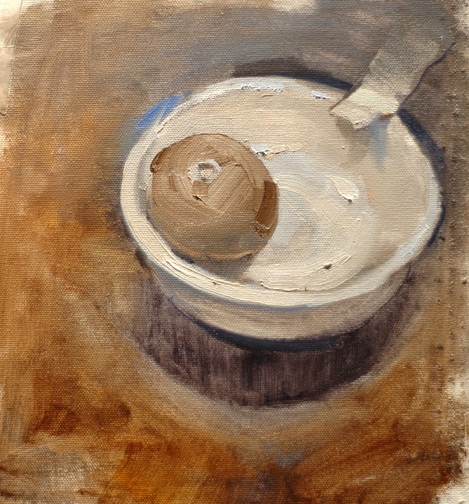
Another useful exercise is to paint a still life made up of all white objects. For example, a white mug, with a white napkin, on a white tablecloth, on a white table, with a white background... and so-on. This will push you to see the subtlety of hues within whites. Yes, everything is apparently white... but what color white is it? It will be some varying degree of temperature (cool-neutral-warm).
This is a great way to develop your eye to see warm vs. cool, the extremes of their relationship and the use of neutrals.
I finished this two day seminar with Titus Castanza on Color Theory. My first attempts at quick sketches on day one were not worth keeping. Then on the second day I found something I had been missing.
ReplyDeleteThe things I learned that I think will help me in the future are.
1. When mixing colors always mix a little of the key color into the white so there is no pure white and there will be a little of the key color in all your light tones.
2. When mixing skin tones determine the value of the color and mix a gray tone to match that value to be added to the color for lightning.
3. During the first two washes use pure color only, remove white from your pallet.
4. Establish the three tones during the first wash.
5. Add a color to the second wash to determine the light and shadow color temperature.
6. In the final phase use only thick paint, remove the thinner from your pallet.
7. Work from dark to light to keep white out of your darks, and thus muddy colors.
8. Paint what you see.
9. Use decisive brush strokes.
I did the white on white exercise. www.morrispainting.wordpress.com/blog-page/
ReplyDelete